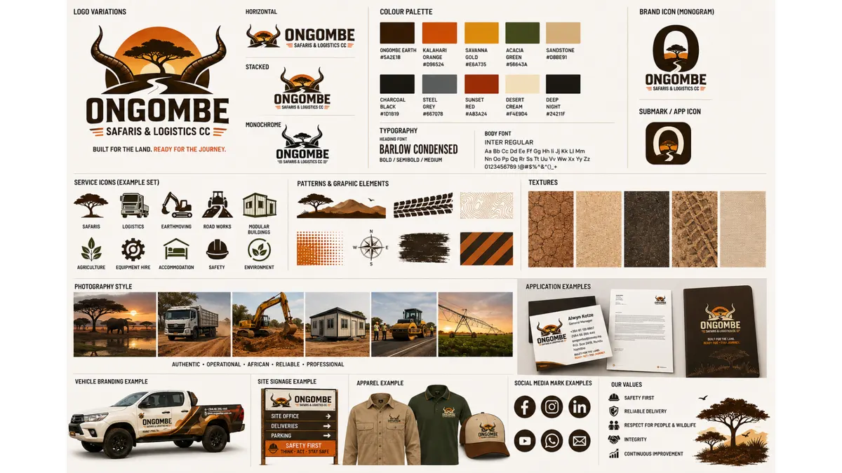
Ongombe Brown
Visual system
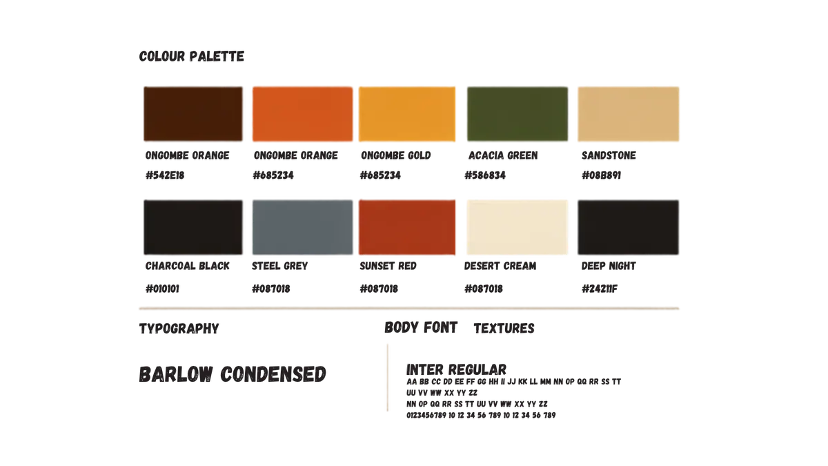
Colour palette
A landscape-led palette that combines sunset energy, acacia resilience, sandstone warmth and operational neutrals.
Approved values
Core and support colours
Select a swatch value to copy it. Maintain sufficient text contrast and avoid unapproved tints in primary identity applications.
Ongombe Orange
Ongombe Gold
Acacia Green
Sandstone
Charcoal Black
Steel Grey
Sunset Red
Desert Cream
Deep Night
Recommended hierarchy
Use colour with discipline.
- Deep Night / Charcoal: primary digital and premium backgrounds.
- Gold / Orange: calls to action, highlights and recognisable brand energy.
- Acacia Green: environmental and conservation-oriented messages.
- Sandstone / Cream: editorial surfaces and warm neutral space.